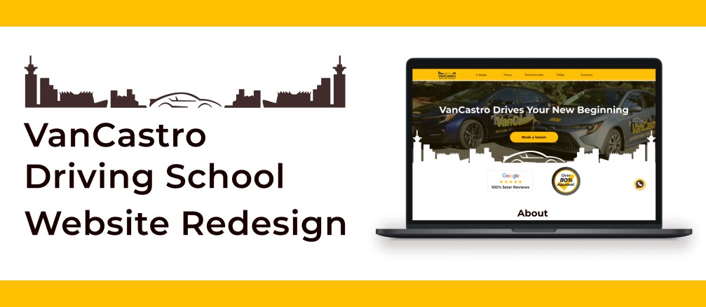
UI/UX Design
Team Project
Role
UI UX Designer
Duration
4 weeks
Tools
Figma, Framer,
Photoshop, Illustrator
Team
3 members
Background
VanCastro Driving School has certificated, qualified and English-Portuguese Bilingual instructors to assist students with and without driving experience serving in 4 locations: Vancouver, North Vancouver, Burnaby and Surrey.
Their service is popular among Brazilians, accounting for over 80% of their customers. One of their key advantages is having their own website, which sets them apart from other Brazilian driving schools.
Their service helps customize lesson content based on each student's skills and experience. As of now, they have 100+ 5 stars reviews on Google and 80% on the first attempt of road test. This allows students to take high-quality lessons with confidence.
Objective
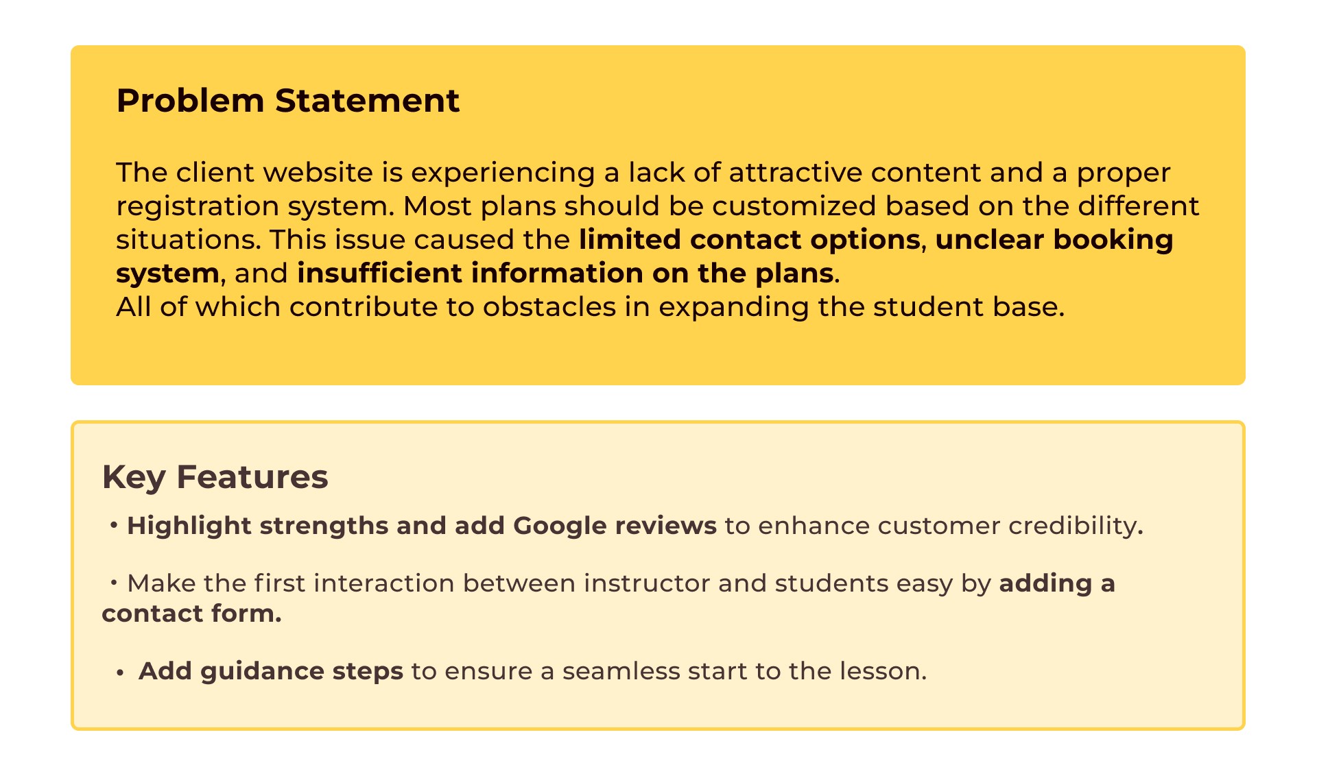
Our goal is to acquire more customers by redesigning the current website's UI, providing a smoother way for clients and customers to communicate and making it easier for users to find the information they need, all while maintaining their brand identity.
Design Process
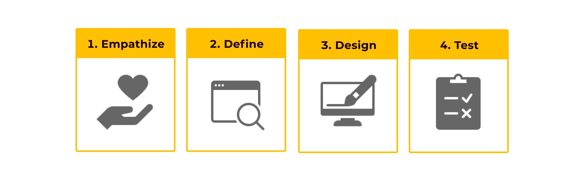
Empathize
Desk Research
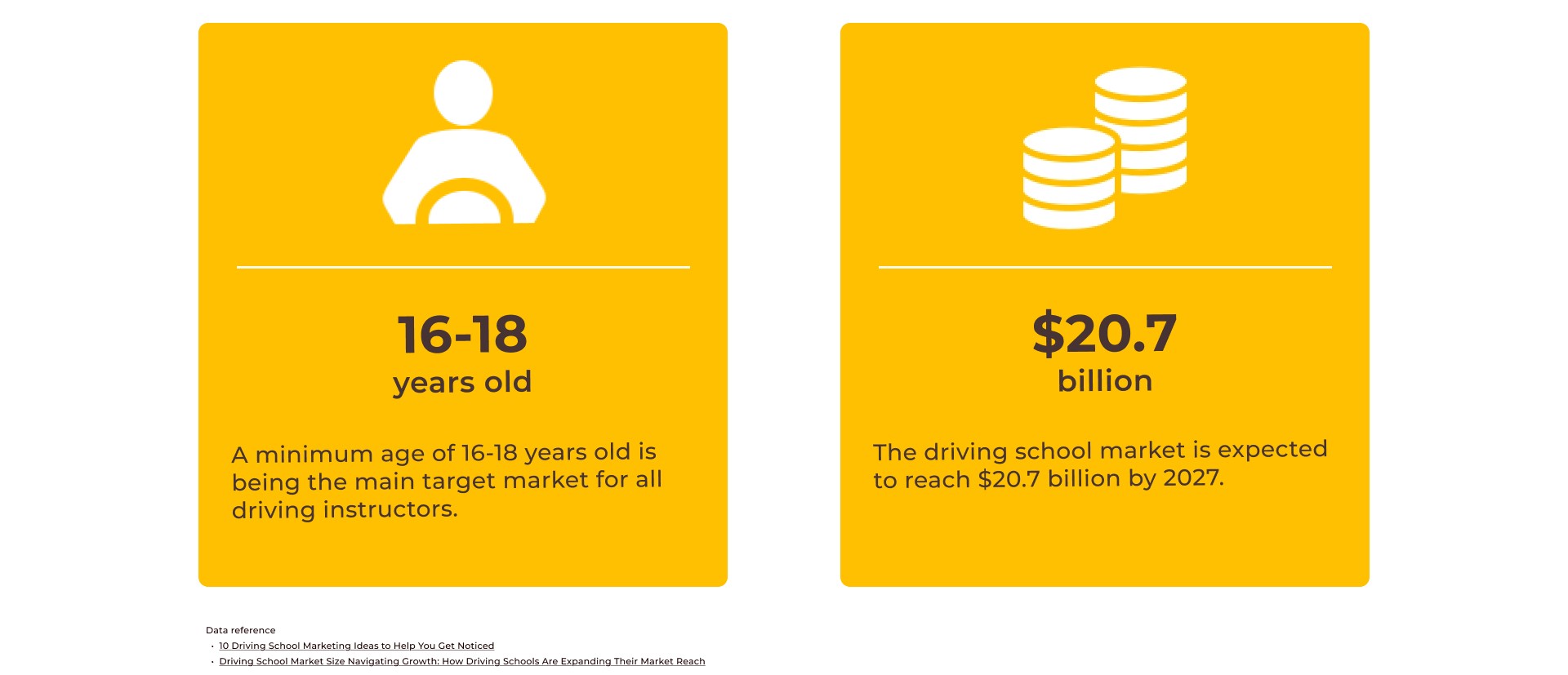
Our initial step to start this project was desk research regarding driving school market and audience target as general information. The legal age for obtaining a driver’s license varies by country, but it is typically between 16 and 18 years old. As a result, many people begin the process at this age. Additionally, this article mentioned not to ignore parents who start driving or improve driving skills. Therefore, we tried to focus on both audiences.
Current Website Analysis
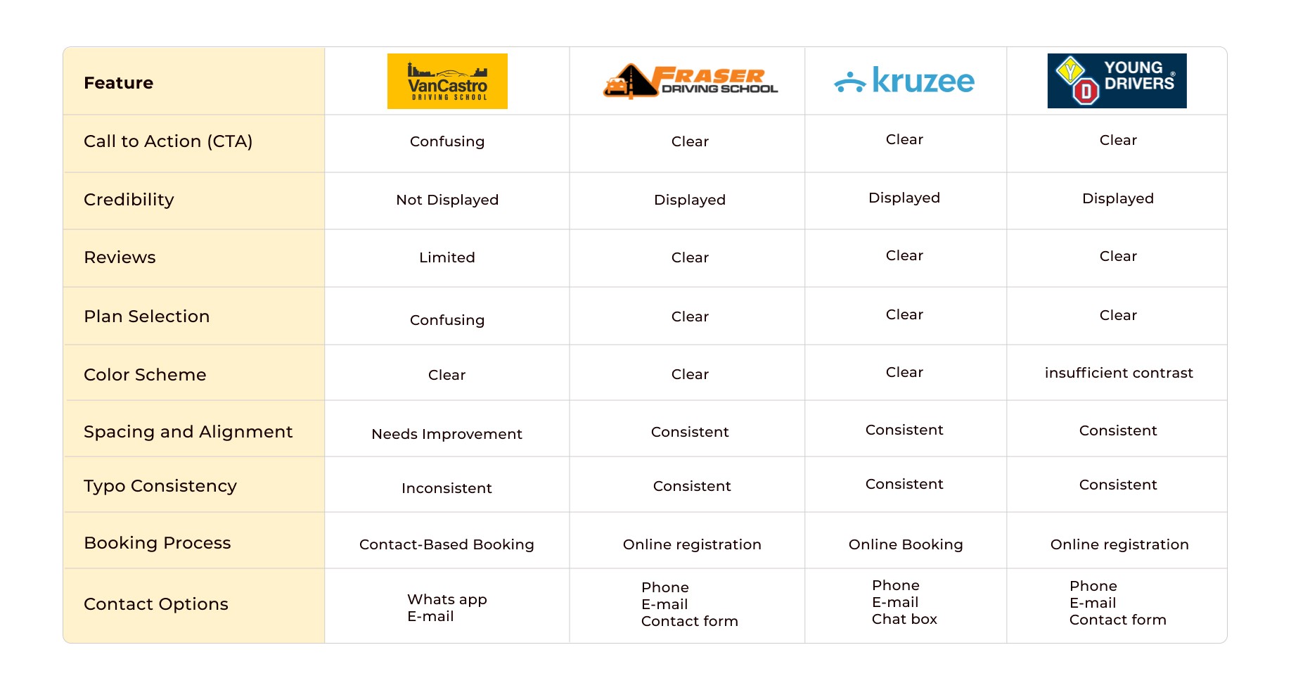
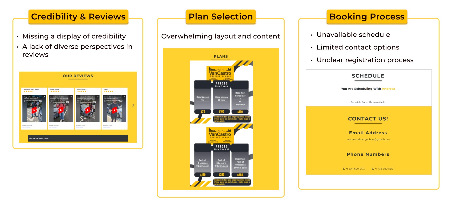
Through Competitor Analysis, three potential issues were found: Credibility& Reviews, Plan Selection and Booking Process.
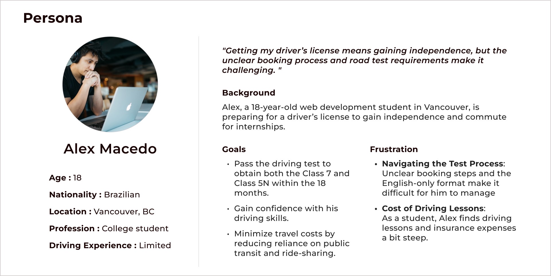
With all information we collect, we created a persona to better understand our users' challenges and motivations.
Define
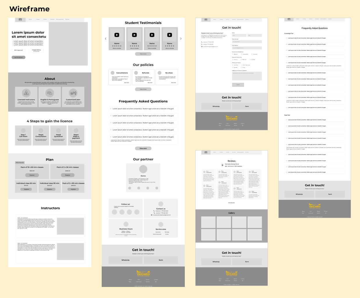
Design
Test
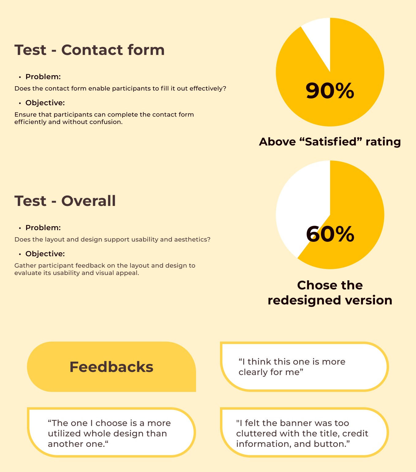
After finishing design phase, we conducted usability test with 10 participants to gather feedbacks about our design. Based on the research, 60% of participants found the enhanced version clearer and easier to understand, significantly improving the overall user experience. We also emphasized credibility as a key factor. Furthermore, the optimized contact form ensures efficient communication, reducing the likelihood of missed opportunities, such as during class hours.
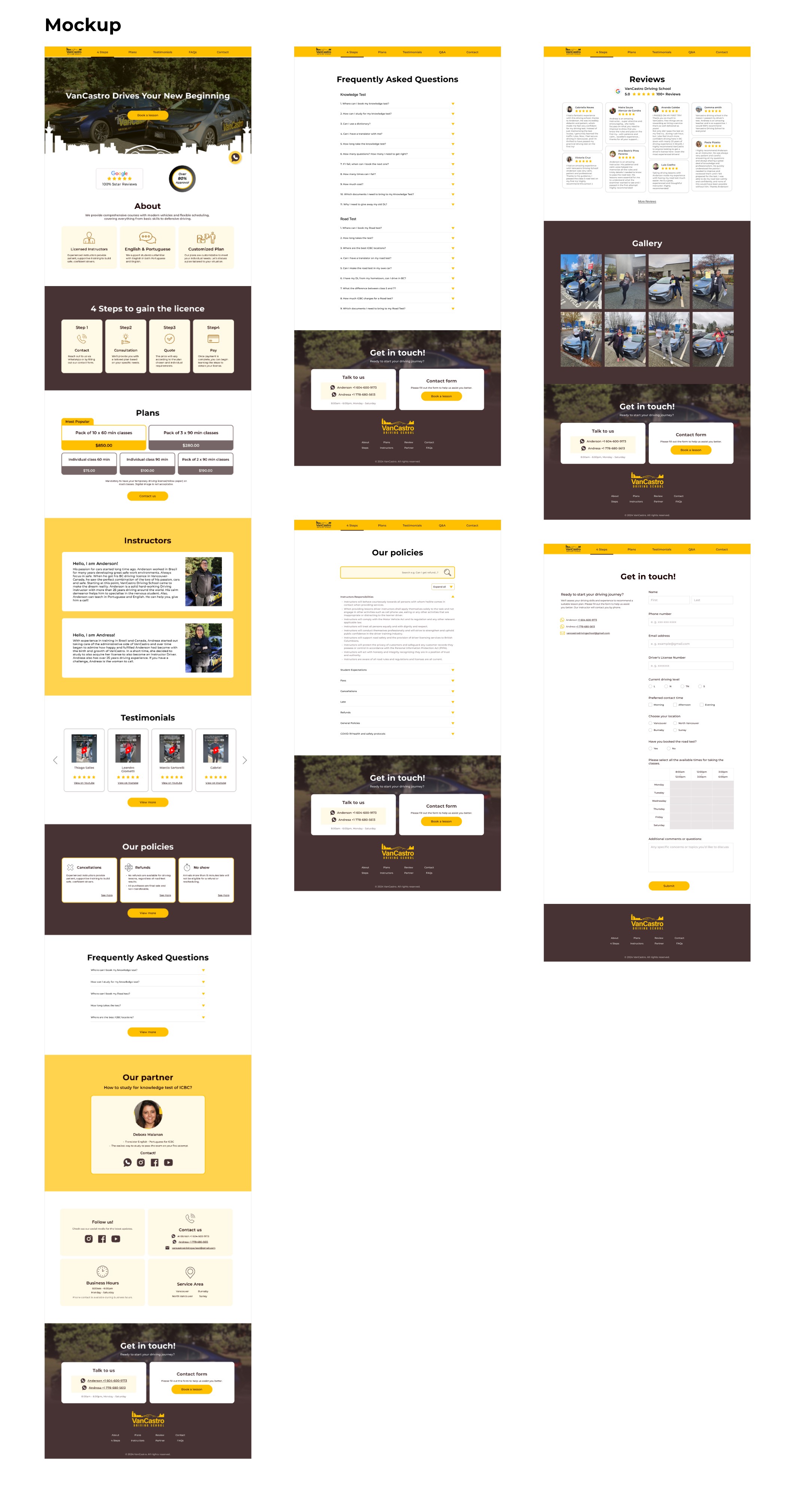
The final presentation to the client was successful. We showcased our redesigned website, clearly explaining the concept behind it and walking them through each step of our design process to highlight the improvements.
Mobile
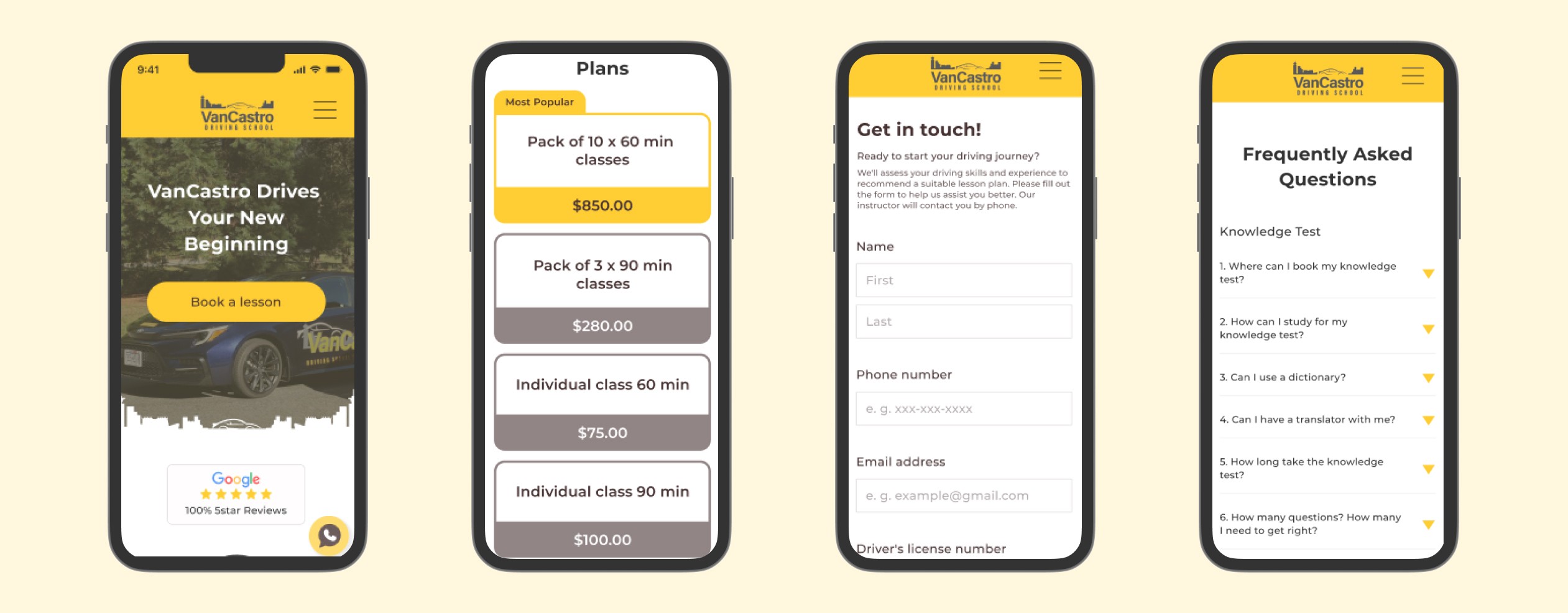
We also ensured a responsive design, making the website accessible and user-friendly on mobile device.
Key Takeaway
The final presentation to the client was successful. We showcased our redesigned website, clearly explaining the concept behind it and walking them through each step of our design process to highlight the improvements.