UI/UX Design
Team Project
Role
Leader
UI UX Designer
Duration
2 weeks
Tools
Figma, Notion,
Illustrator
Team
4 members
Project Overview
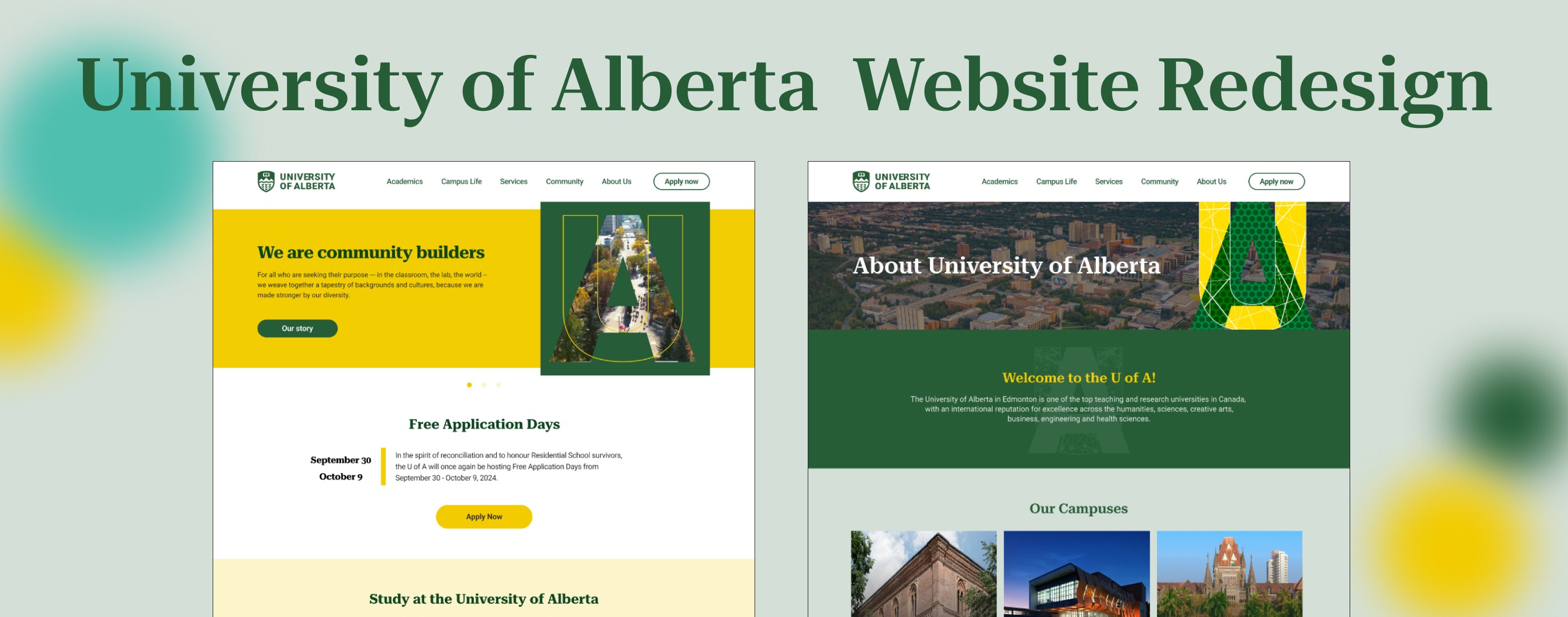
The goal of this project is to improve a university website so that people can easily access the information they need by simplifying navigation. The original website had problems with alignment, font size, color consistency, and information organization, based on our evaluations of it and competitors. This gave our redesign approach a distinct direction and assisted us in identifying each positive and negative aspects. We gave each member a page to work on during the design phase, offering advice and making improvements. To make sure our redesign fulfilled user demands, we also conducted usability testing to include user feedback. We concentrated on increasing accessibility and utility in addition to aesthetics. Through tight teamwork, we improved the website to offer a more user-friendly and intuitive experience.
About University of Alberta
University of Alberta is a Top 5 Canadian university in Edmonton, Alberta. It was established in 1908 by Henry Marshall Tory as its first president. The university is renowned for its paleontology research, ranking fifth globally. Additionally, it is internationally highly regarded in fields such as forestry, geology, petroleum engineering, transplantation studies, and sports-related disciplines.
Objective
Our goal is to enhance the user experience (UX) on the University of Alberta website through the redesign, making it easier for users to find the information they need.
Design Process
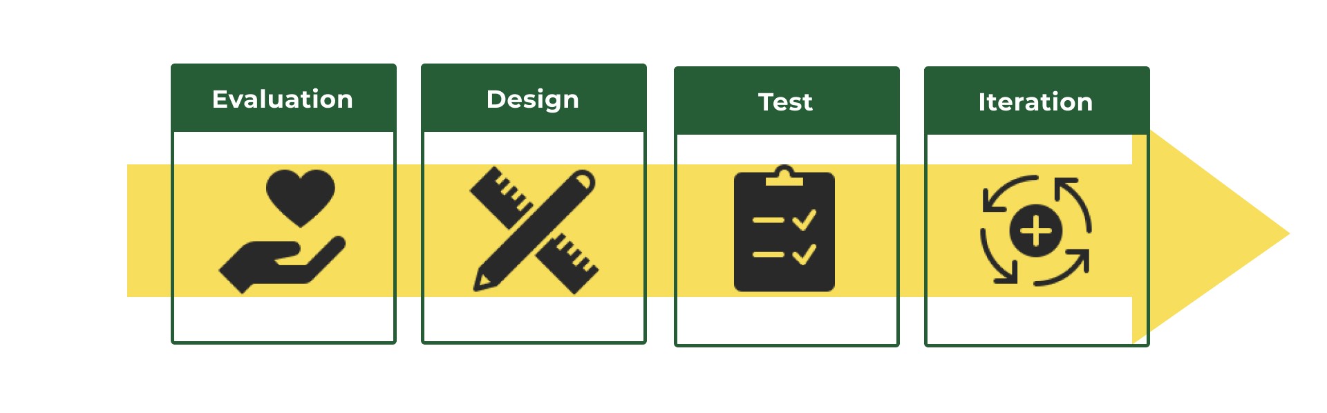
Evaluation
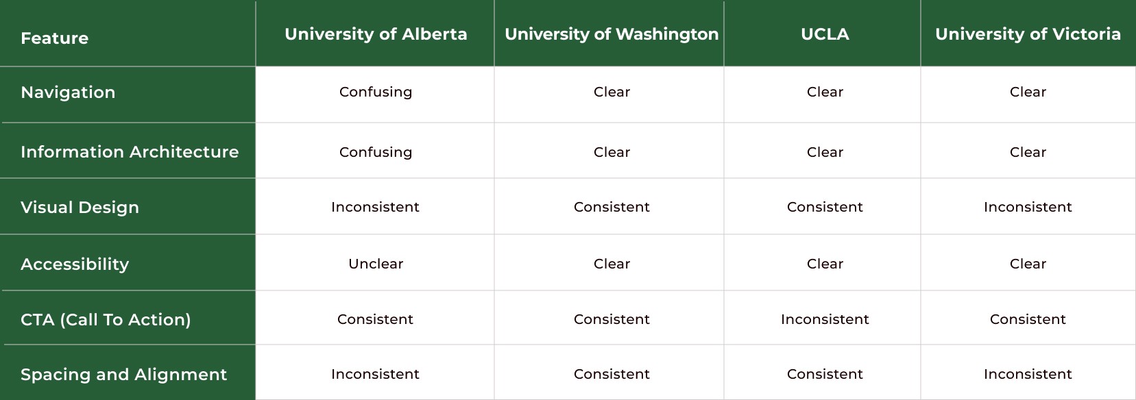
Competitor Analysis
There are many other universities in North America, so we identified key competitors and evaluated their websites based on several features. Through this evaluation, we found areas for improvement, such as unease of finding key details, inconsistent alignment and spacing, and excessive text.
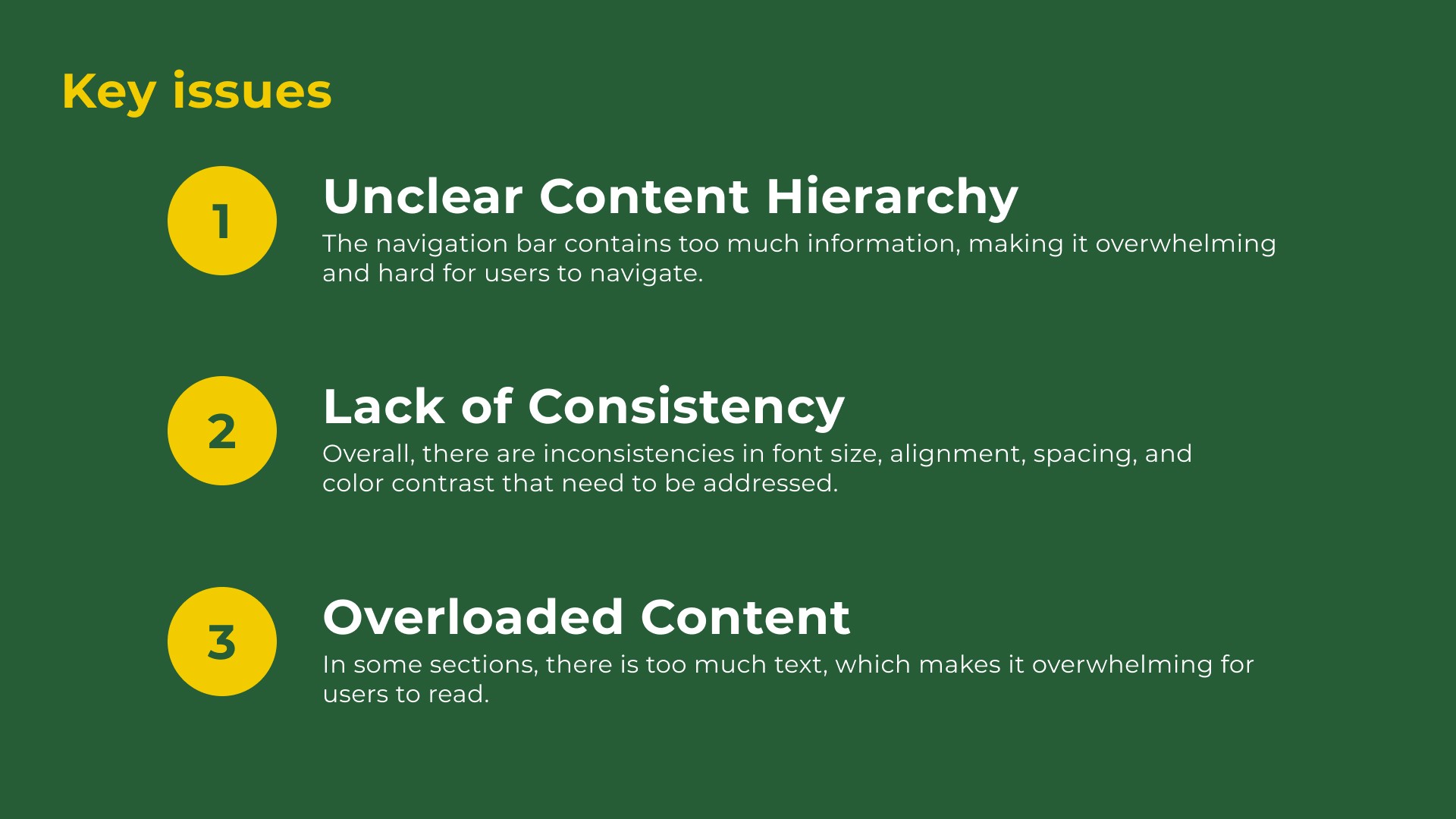
Key Issues
Through research, we identified three key issues on their website that significantly impact user experience and make it challenging for users to achieve their goals effectively.
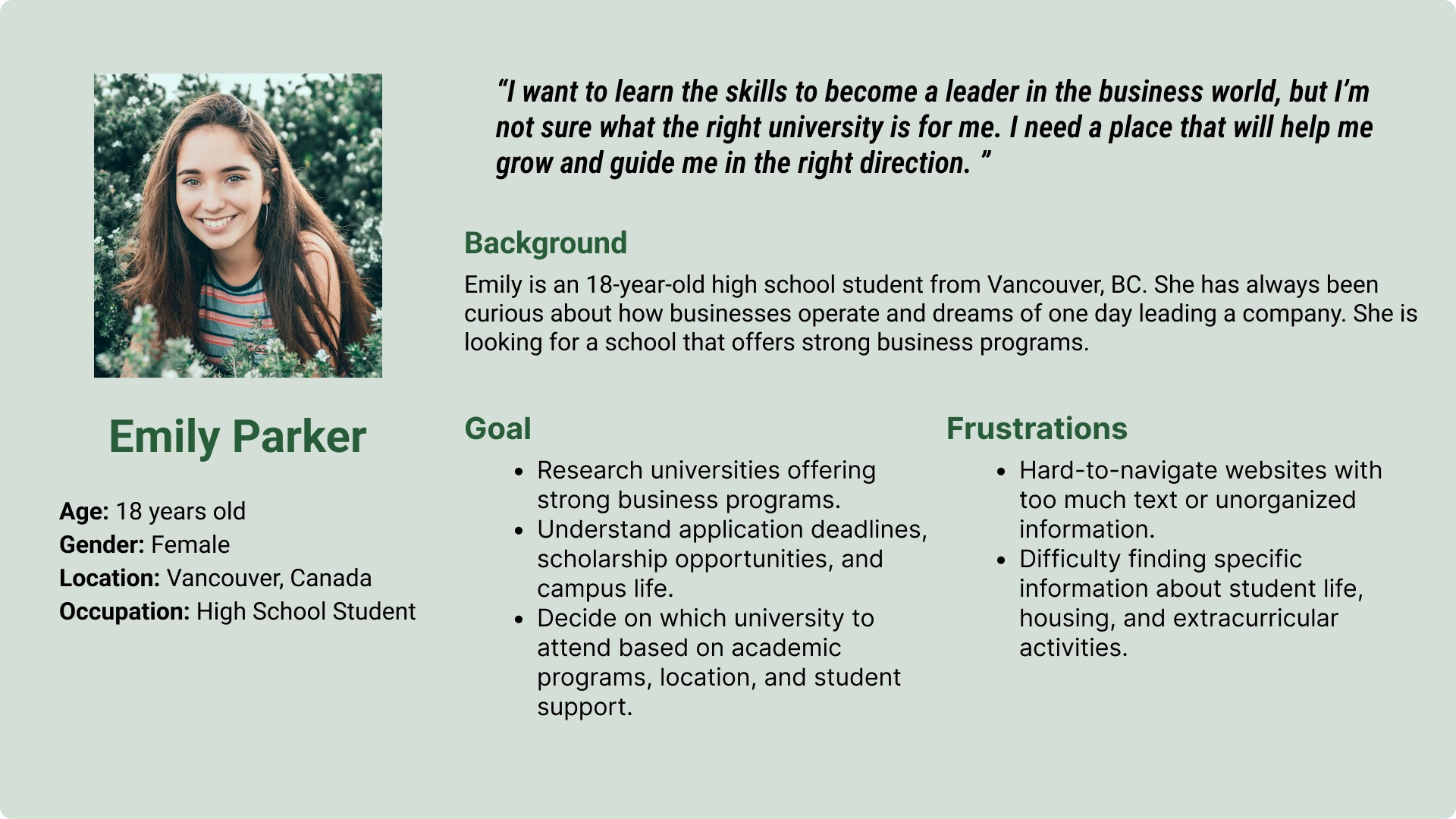
Persona
Based on analysis and research, we created persona. This persona helped our team understand the target users' needs, goals, and pain points more clearly.
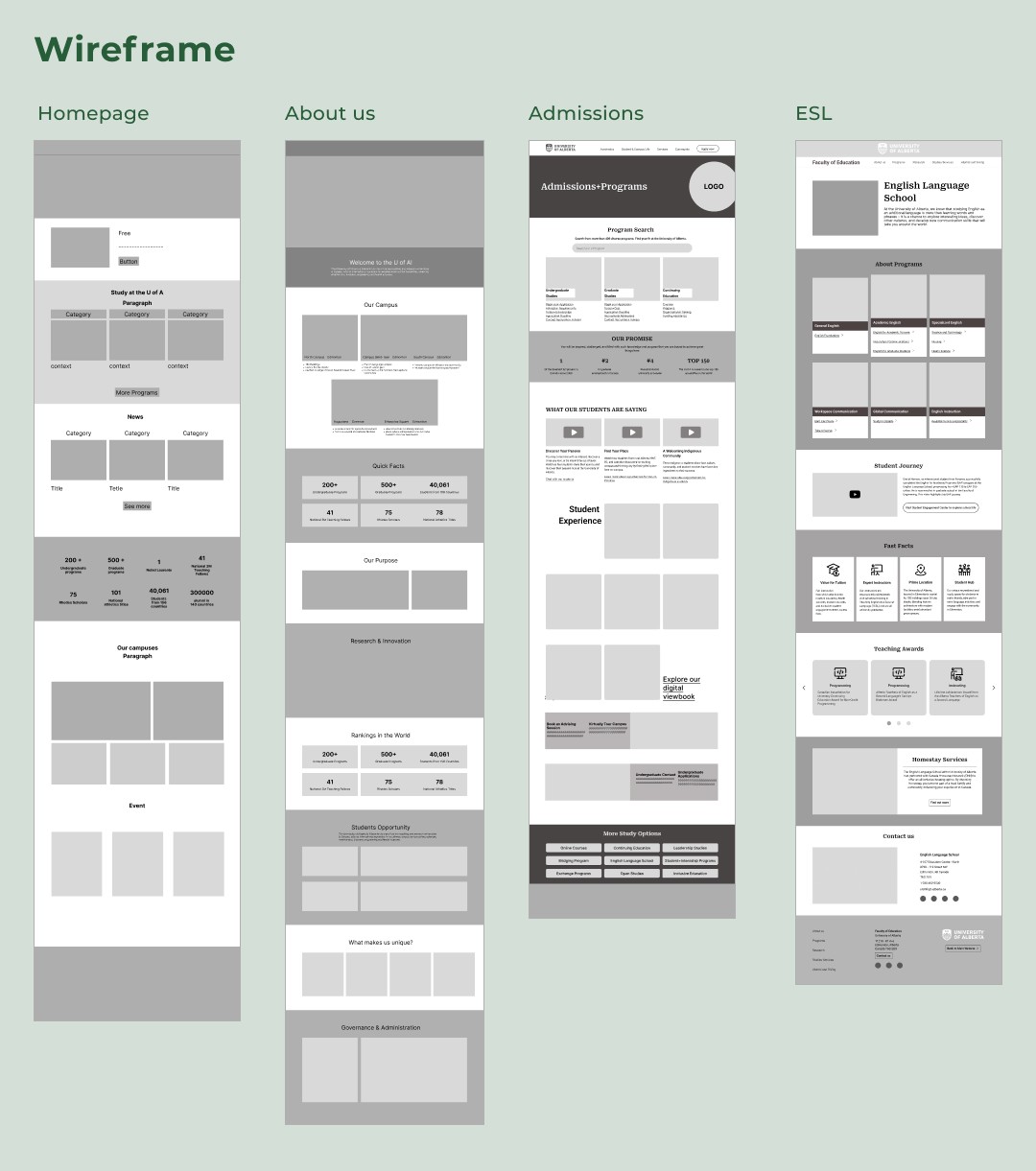
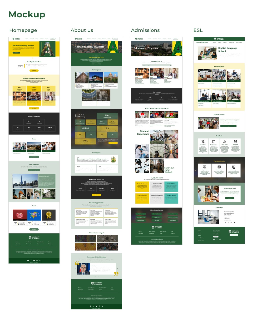
Design
Test
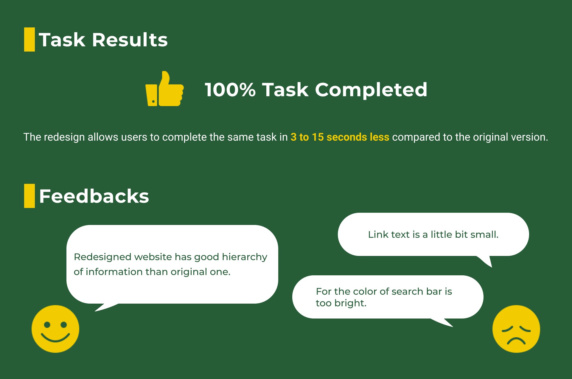
To validate whether our design was working correctly, we conducted usability testing with 2 participants and assigned them four tasks. We received a lot of feedbacks and insights.
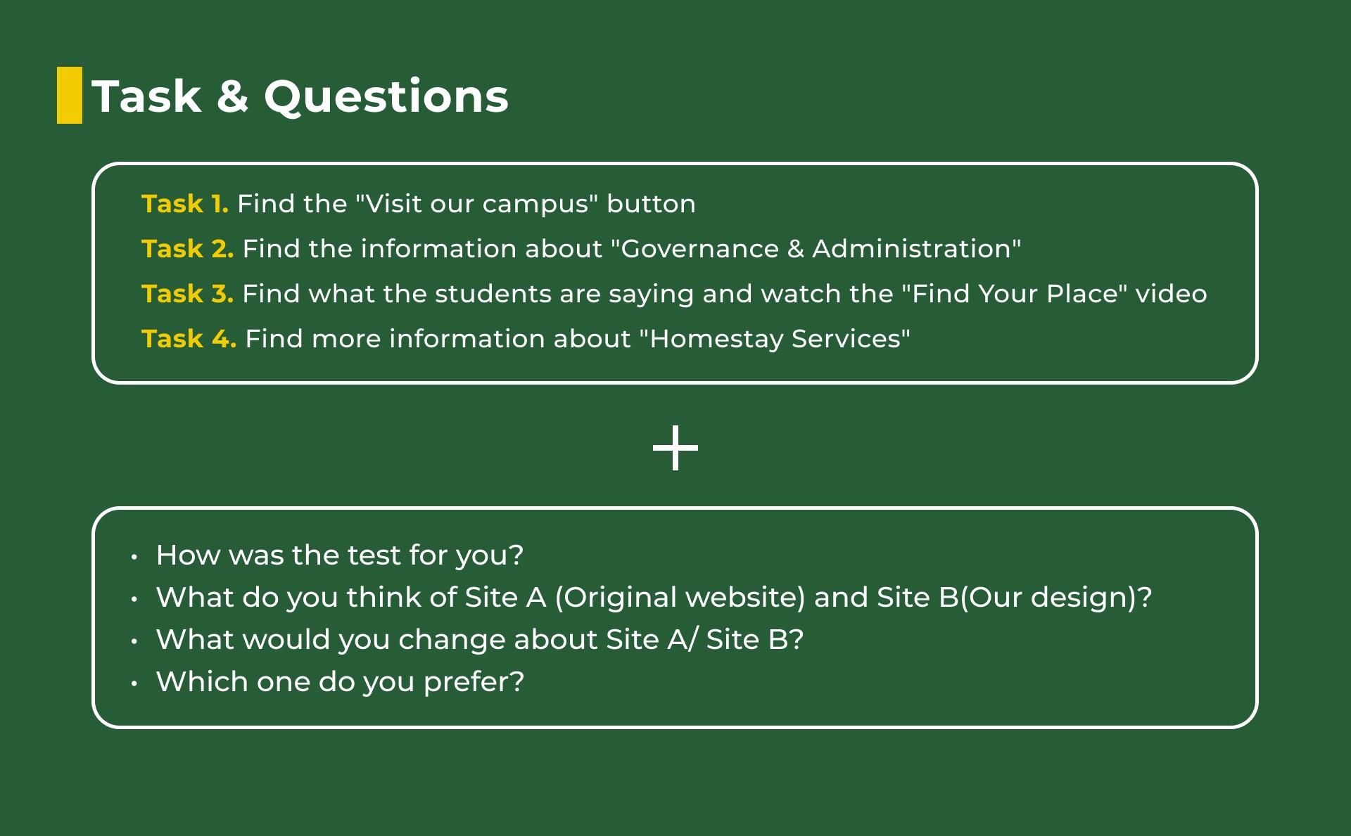
Key Takeaway
Simplifying the navigation structure significantly improved task completion rates and user satisfaction.
Compared to the original website, we successfully improved color contrast, font sizes, and information hierarchy, creating a more visually accessible and user-friendly design.
Effectively utilized Notion to manage individual tasks, ensuring everything progressed smoothly and stayed on schedule.